When you look at a dashboard, what is the first thing that catches your eye? Is it a pie chart? What about bright colors? If your answer was something besides the critical data, then your dashboards are not doing their job. The goal of a dashboard is to present the data that is most relevant to the end user to help them complete a task. Unfortunately, that is not always the case when it comes to dashboard design. The dashboards I create will follow the design philosophy of Stephen Few. His theory on design presents data in a minimalist way where important information stands out through subtle techniques. The goal of HCMinsight is to provide dashboards that emphasize the data over everything else. There will be no bright colors, or hard to understand graphs, to distract you from the data vital to running your human resources department. Click on the radar graph below to see a critique from Stephen Few on what is wrong with this graph, and how it can be improved.
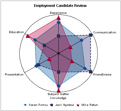
How could this graph be improved?
No comments:
Post a Comment